SARAH EMERY CELEBRANT
01. OVERVIEW
Sarah Emery is a wedding celebrant on Sydney's Northern Beaches who came to the work from a career in television and events production. She writes and performs ceremonies across Sydney and runs destination weddings, and she offers options other celebrants tend not to push.
Her previous site was a Wix build whose layout treated her like any other warm, pastel wedding celebrant. It leaned on category defaults and buried the one thing no competitor can claim: that she produces a ceremony the way she spent a career producing stories on screen.
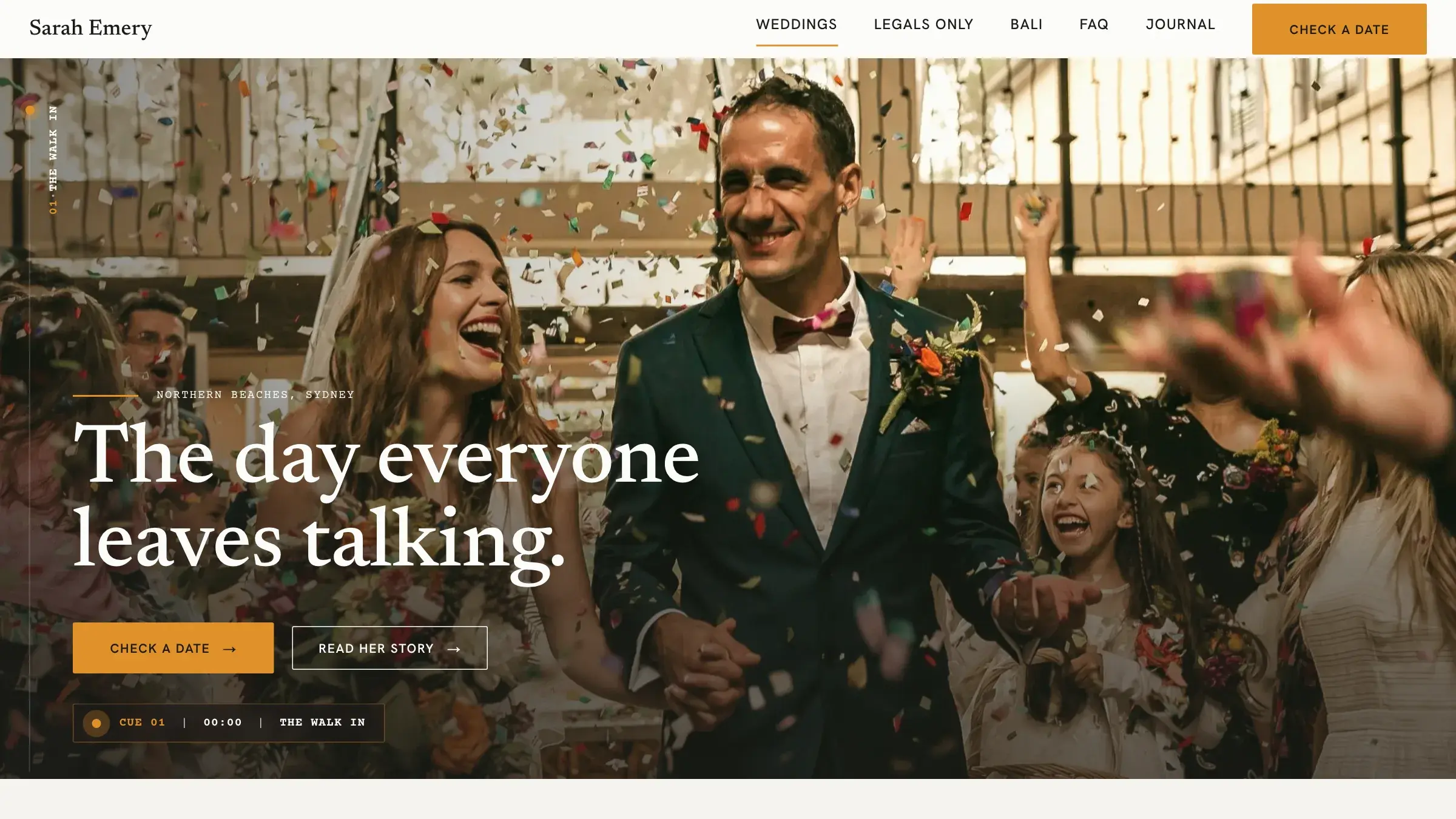
I rebuilt the site end to end as a fast, self-owned Next.js build and gave it a single owned concept nicknamed Cue Sheet. The whole page is structured like a ceremony in production, run scene by scene from a broadcast cue sheet, so her real craft becomes the site's design language rather than a line in her bio.
02. THE CHALLENGE
The hard part was proving competence in a category that all looks and sounds the same, then turning that trust into a single clear enquiry.
03. THE SOLUTION
I built the site out of Sarah's actual craft, so the design could not be reskinned onto any other celebrant.
The Cue Sheet concept
A single owned idea: the site runs like a ceremony in production, scene by scene from a broadcast cue sheet, sourced directly from Sarah's own line about bringing television storytelling to a wedding.
The Cue Rail signature move
A slim broadcast-style rail down the left margin of every page. As you scroll, a playhead advances and the active cue lights up in autocue amber. Each page runs its own cue list, and the final cue is always the call to action.
One path to enquiry
Every page terminates in the same primary action, Check a date, which opens her availability enquiry. The rail's last cue only lights once a visitor checks a date, so the enquiry is the natural end of the story rather than a competing banner.
A palette pulled from her trade
Bright, high-key Northern Beaches daylight, true white rather than the category's cream, with a single autocue-amber signal borrowed from a teleprompter. Her own ceremony photography carries all the warmth. No stock, no styled flat-lays.
Production-document typography
Screenplay mono for the cues, timecodes, and scene labels, a literary serif for the spoken ceremony lines, and a warm humanist sans for body copy.
Her voice, kept intact
The redesign changed the structure and look, not her words. Her warm, inclusive, unmistakably Australian voice was codified from the existing site rather than reinvented, and her real services stayed front and centre.
04. RESULTS
The site now reads as one specific celebrant with a production background, not an interchangeable template:
Unmistakably hers
The site reads as one specific celebrant with a production background, not an interchangeable pastel template. Swap her name out and the concept breaks, which is the point.
Reassurance is the sales argument
The cue rail makes her competence visible and concrete before a couple ever fills in a form, showing exactly how a day is run, produced by someone who has run many.
A site she owns
Rebuilt off Wix into a fast, self-hosted Next.js build, with her forms, blog, and imagery migrated intact, structured to be found rather than locked inside a template.
Sarah tells love stories on screen for a living, so instead of another pastel wedding template I built the whole site to run like the thing she actually makes: a ceremony, cue by cue, with her in the director's chair.